The relation between the satellite view and map
Starting editors often tend to draw the map exactly like the satellite view shows. However, the Waze map should be as simple as possible, in a way that yield the best navigation instructions, with a clear and simple map on screen. This implies that sometimes roads or parts of roads are even not drawn, or drawn differently from the satellite view. In addition, the satellite view may be outdated or doesn´t show everything. For example, a road in a forest is probably not visible on the satellite view. Thus, use the satellite view as a source, not as a goal to copy. In case the road is mapped differently, please consult the previous editor or the area manager.
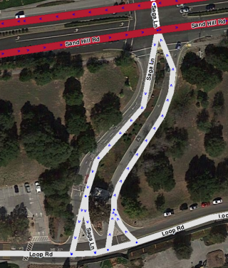
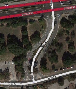
Many examples can be found on our KISS page.
Too many geometry nodes
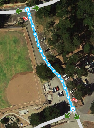
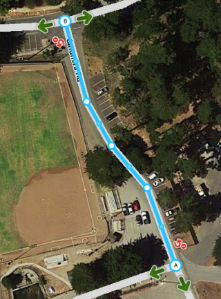
Too many geometry points can slow down the build of your screen. Also, it is harder to maintain the map. Therefore, we use as few nodes as possible, even if that means that a road in Waze does not exactly follow the road in the Satellite View. If a segment has too many nodes, please remove them by hovering your mouse over the nodes, and press d.
If you prefer more rounded corners than square ones - right picture - you can use two geometry nodes instead of one for creating a corner. For more information see the Create a road paragraph in the Quick Start Guide.
Simplify an intersection


More examples of drawing complex situations can be found in KISS.
Road types
Starting editors often tend to change the road type of a segment. Choosing the type of a road segment has many implications, due to the consequences for visibility, routing and such. These typics can vary across countries and you will see some of these differences when choosing another language in WME. Thus, some road types are differently used than expected at first sight, and some are even not used. If you think a road type should be changed, please consult the last editor or the Area or Region Manager.
For more information check the Road types page and sub-pages.