Simple is better
When representing junctions between roads, we sometimes have to blur the lines between the physical and logical worlds. The primary goal should be to represent things as simply as possible and only introduce complexity to deal with an issue.
The Basics
Lets start with the very basic case of one road branching off from another. Most of the time they will probably meet at close to a 90 degree angle. This is the simplest situation to deal with since the physical and logical views of the roads match up very well.
But you will probably find roads that meet at odd angles as well. Even in urban areas with rigid grids, you will often find at least one road that has existed since prior to the establishment of the grid which cuts through town at strange angles. The initial urge will be to represent the junction as it is in the physical world - two lines running into each other at some angle.
But there are issues with this method. Depending on the angles, the client may give a "Keep Right" instruction to the driver when a "Turn Right" instruction is more appropriate. In some cases, it is even possible the angle may be such that no instruction is given at all. Or worse yet, the routing engine may determine that it isn't possible to make a very sharp angle and not suggest a turn (in the example image, headed south and then turning left to head east).
To eliminate ambiguity, we need to treat the junction from a logical point of view. Since we want to be given basic "Turn Left" and "Turn Right" instructions, we have to treat it like it was a basic 90 degree intersection. But how do we do that when the roads don't actually diverge at 90 degrees? What we need to do is to add some geometry nodes to make the branch road leave the main road at close to 90 degrees, then we gradually curve to match the true departure angle.
Now we have a junction that logically works like a basic 90 degree junction but it also fits the reality of the physical world.
A ramp to a highway is another good example where additional geometry nodes are helpful. Especially since most ramps diverge at a very small angle from the road.
The drawback in this case (which also exists for the side road example above!) is that it may be very hard to see and click on the turn restriction arrows in the editor.
But if we just add one more geometry node to make the departure angle at the junction itself closer to 45 degrees...
...now the arrows are visible and accessible.
We can easily scale the above approaches to a four way junction. Again we can expect to mostly see angles close to 90 degrees.
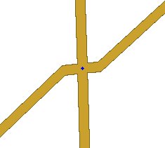
And if we have that odd street cutting across town at an odd angle, we again want to avoid the odd angle at the junction...
...and we want to use geometry nodes to bring the actual junction to 90 degrees. You can zoom in as close as you can and add a single geometry node on each side. This will give us the proper angle but make it virtually invisible to users so it looks just like the physical world.
The above image is what you would see zoomed in as close as possible. Zoomed back out, it looks just like the image showing the junction without any geometry nodes.


